August Staff Picks
Kirsty Sumerling chose: Juliette Bigley, Line and Form (circular)
Juliette Bigley’s Line and Form (circular) is created entirely from flat sheets of metal and is fabricated by hand in her workshop in Walthamstow using various traditional and contemporary metalsmithing techniques. This piece plays with the idea of contrasting elements – both in form and material. The use of chemical patination creates an amazing contrast between the warm copper and the cool mottled tones of the patinated copper. A perfect pairing of materials for an outdoor sculpture.
Tommy Zyw chose: Ewan McClure, Summit
McClure’s subject is the play of light on drapery, captured in a bold composition of sweeping brushstrokes. Bravura painting at its best.

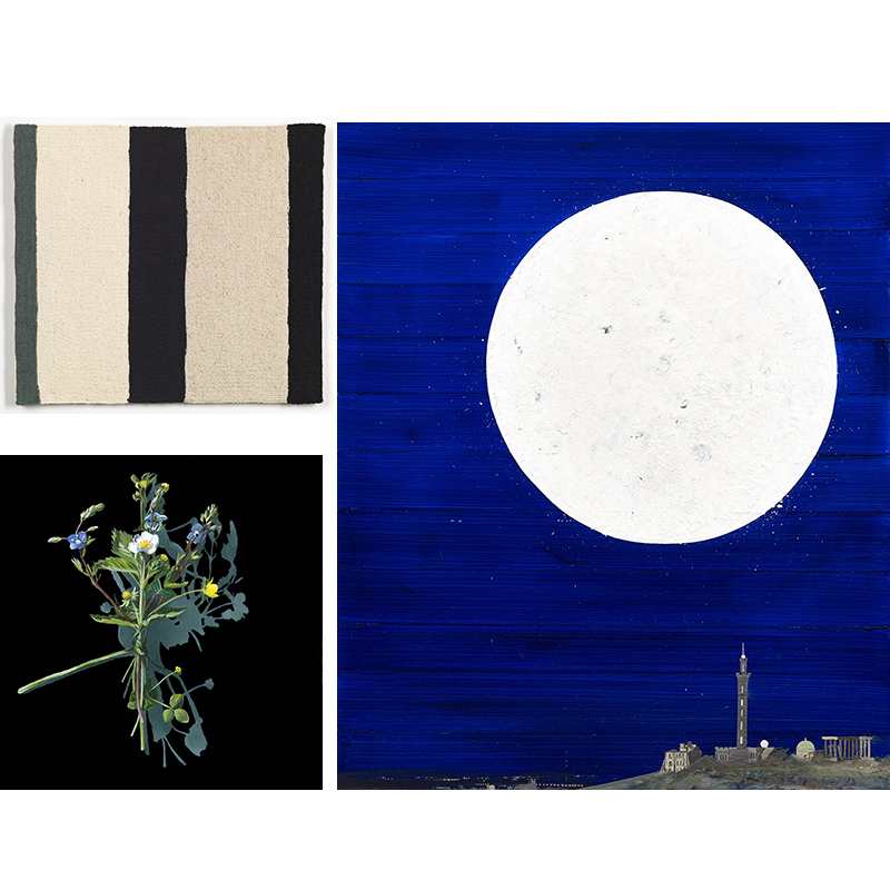
Ruth Leslie chose: Sara Brennan, Two Black Linen Verticals with Old Grey/Green
Weaving is a skill I greatly admire, so I am always drawn to tapestries, especially those that really focus on the process and detail of the weave. Sara Brennan works from a series of drawings and paintings, often repeatedly exploring the translation of a surface or mark into tapestry. She also works as a direct response to the reaction and relationship between yarns, with a disciplined and restrained approach to colour, tone and form. I love the simplicity of Two Black Linen Verticals with Old Grey/Green – simple from afar, but full of intricate details when you look up close! An elegant artwork for any home.
Sophie Lawson chose: Kirsty Lorenz, Wild Strawberry after Mary Delany – Votive Offering No. 87
I find Kirsty Lorenz’s flower paintings really intriguing. Her technical ability is clear – and yet – the way she titles them adds an element of mysticism or symbolism that sets them apart from scientific drawing or pure photorealism. In addition – the wild strawberry set on a black background with its shadow painted in reminds me of Warhol’s Flowers.
Christina Jansen chose: Jock McFadyen, Calton Hill No. 5
This is a classic painting by Jock McFadyen, another in this series hangs in the permanent collection at the Scottish National Gallery of Modern Art. This year Jock coordinated the Summer Exhibition at the Royal Academy in London, in which he exhibited a bigger version of this painting. We had him in the other day to sign a big stack of books for us, written by architecture critic Rowan Moore, it is a fascinating telling of Jock’s life that cements him as a vital figure in contemporary Urban painting.
Guy Peploe chose: Elizabeth Blackadder, Interior with Persian Rug, No 5.
Blackadder is best known for the watercolours, and amongst these for her flowers and cats. Her oil paintings are relatively less known but reveal her as a painter of immense sophistication both as an image maker and as a physical painter. Here the constituents are simple; rug, chair, jacket and window but in the organisation of colour and masses, in the delicacy of the paint and sure drawing she had created a masterpiece.
Elizabeth Campbell chose: Koichi Io, Whirl Vase
I am amazed by how Koichi so skilful manipulates the metal to create pieces with such fluidity. His colourful patinated finishes give such a richness to his work – this red patina reminds me of Japanese lacquer work.
Laura Cooper chose: Lindean Mill Glass, Wrap Vases & Two Colour Vases
I have bought work from Lindean Mill Glass before – I think these vases are so unique and display flowers beautifully!

Lisa Muxworthy chose: Michael Becker, Lapis Lazuli Chain
I really admire the skill, simplistic detail and perfection of Michael Becker’s work. Lapis is such an incredible, rich stone and we don’t see it often here, however it really suits all skin tones – including white Scottish porcelain skin!

July Staff Picks
Laura Cooper chose: Ruth Leslie, Mini Bell Jar Earrings.
I am a big fan of Ruth Leslie’s work, and think these are a perfect pair of earrings – simple and elegant and suitable for anyone of any age!
Lisa Muxworthy chose: Ella Fearon-Low, Flying Cloud Earrings with Golden Drops in Rich Blue.
I bought these earrings to wear at a wedding and received so many compliments, they are so special, yet light and easy to wear, I simply love them. All Ella’s designs are striking, the attention to detail and her use of precious and non-precious components is so clever, wearing them is a joy.
Sophie Lawson chose: Angie Lewin, Wild Shore.
Angie Lewin’s prints are so joyful. This print of wildflowers at the beach is a lovely and familiar Scottish summer scene, breeze perceptible on the sea and a bright clear sky that we have all been anxiously awaiting this ‘summer’.

Christina Jansen chose: Hitomi Hosono, Small Nadeshiko and Mangrove Leaves Bowl.
In May 2019, the gallery held an exhibition called A Natural Selection which included the first major presentation in Scotland of Hitomi Hosono. Hitomi Hosono, originally from Japan and trained in Tokyo, London and Copenhagen has worked with the Wedgwood company and has taken the classic sprig form and made it her own art form. This work beautiful bowl is a porcelain thrown bowl, then altered and decorated externally and internally entirely using sprigs. Sprigs are made from modelling a shape and then turning into a mould. Porcelain is poured into the mould so that numerous sprigs can be made and used. In this case, the Nadeshiko and mangrove are the source of the sprig. Hitomi’s work is therefore quintessentially English whilst speaking entirely of Japan. The natural world is her main inspiration for her work but nothing is as it appears: her translation of the natural world is entirely unique. It is a privilege to have her work in the gallery. The British Museum in London have a superb example which takes centre stage in their Japan gallery.
Elizabeth Campbell chose: Lizzie Farey, Larch Bowl.
For July’s staff picks I have chosen a lovely little willow bowl by Lizzie Farey. I love how the bowl is woven to incorporate the little pine cones which sit balanced around the edge.

Tommy Zyw chose: Barry McGlashan, The Lighthouse. Each of Barry McGlashan’s paintings can be seen as a stage set, carefully constructed with the eye of a master director. In The Lighthouse a solitary figure walks toward a distant lighthouse, engulfed by the warm light of his lantern as the sea rages against the distant rocks.

Ali McGill Chose: John Houston, Summer, Gullane.
This vibrant gem of a painting is a great example of Houston’s skill at interpreting the glowing sky and shoreline of the East Coast. The sunset skies and varying weather conditions are captured in paint perfectly.

June Staff Picks
Christina Jansen chose: Lindean Mill optic tumbler
Annica Sandstrom and David Kaplan are the glass artists behind Lindean Mill Glass from the Scottish Borders. They have been making the classic optic range of glasses for over 40 years and the optic tumbler is a classic. It is beautifully proportioned and the perfect size for everyday use with a signature bevelled shape and coloured rim. This is a firm gallery favourite – we have stocked the optic range since the 1980’s.
Lisa Muxworthy chose: Alison McGill, Shoreline
Alison McGill’s paintings have a sense of peace that make me smile just to look at them. They are quiet, yet precise and I see something different each time I see them. The colours and setting in this painting Shorelines captures a moment so familiar, she somehow draws you into the peace. This painting is as wonderful as the artist, who I am lucky enough to call my friend.

Ruth Leslie chose: Michael Becker, Lapis Earrings
Michael Becker is a German Jeweller, whose work is in many public collections such as the V&A in London, Cooper Hewitt in New York and the Musée des Arts Décoratifs in Paris and Montreal. I am a huge fan of his work, due to the craftsmanship as well as the running theme of blue and gold – a beautiful and contrasting combination. The rich blue colour of Lapis suits nearly everybody, and the surrounding solid gold intensifies the colour. Lapis Lazuli remains one of the most sought after stones since human history began!
Tommy Zyw chose: Victoria Crowe, Reflect Sculpture
Although renowned for her painting, Crowe has worked in three dimensions including this sculpture dating from 2009. The title of the artwork, Reflect describes the literal reflection cast in the bronze mirror but also illustrates an inward search of thoughts and feelings. Mirrors have been an important motif throughout the artist’s work in recent years. Victoria Crowe’s major new retrospective exhibition has just opened at the City Art Centre in Edinburgh.

Laura Cooper chose: Mark Hearld, Muscovy Drake and Muscovy Duck I
I love this pair! I’m particularly taken by the spotty painted frames of these mixed media works that resemble the pattern of bird’s feathers. I think it is so clever because, like feathers, the frame protects the birds within.
Kirsty Sumerling chose: Claire Harkess, Eagle Owl I
Claire Harkess has captured the essence of the magnificent Eagle Owl in flight. The mere suggestion of marks and her use of watercolour depicts the powerful movement of its sweeping wings.

Ali McGill chose: Jo Hayes Ward, random structural band in 18ct yellow gold
I love the geometric shape and texture of this ring and the way that the light catches the surface structures.
Sophie Lawson chose: Calum McClure, Bathing Cabin Nyon
Calum McClure paints here with the most beautiful blue – I really like the way he paints the water rushing forwards, reflecting the sun back at us and the contrast of these bold gestures with the delicacy of the trees in the background that remind me of dried grasses.

Guy Peploe chose: Joe Fan, Spring Time Chaos
I have chosen this as a perfect example of Joe Fan’s extraordinary draughtsmanship – certainly not to say there has been any chaos at The Scottish Gallery this spring!
Elizabeth Campbell chose: Kirsten Coelho, Bottle and Bowl.
The first exhibition I helped with when I started working at The Gallery was Fine Lines, which featured work from Kirsten Coelho and I have admired her work ever since.
Beautifully minimal forms highlight her skills in porcelain and act as a canvas for her matt white glazes and iron oxides. The combination of form, colour, tone and light in her pieces make them irresistibly tactile and engaging.

